
Best Fonts for Resume in 2024
Updated November 20, 2023


- What Is the Best Font for Resume Writing?
empty
empty
empty
empty
- The Best Fonts for Resume Writing 2024
empty
empty
empty
empty
empty
empty
empty
empty
empty
empty
- What Font for Resume? How to Choose
empty
empty
empty
empty
- What Size Font for Resume?
empty
empty
empty
- Frequently Asked Questions
- Final Thoughts
Best Fonts for Resume Writing:
Good fonts for resume writing are those that have clean lines, are easy to read and are used widely in professional documents:
- Calibri
- Verdana
- Arial
- Garamond
- Times New Roman
- Trebuchet MS
- Didot
- Helvetica
- Cambria
- Book Antiqua
A resume is an important part of a job application, there to convey your qualifications, skills and experience to potential employers.
While the primary focus should be on its content, it’s also crucial to consider presentation, and that includes your chosen resume font.
This article offers advice on how to pick the best font for resume writing along with examples of good fonts for resumes to help guide your decision.
If you’re starting completely from scratch you might want to read our guide on how to write a resume first.
Once you have your content planned out, you can then move on to choosing a font to give the document a polished finish.
What Is the Best Font for Resume Writing?
A resume is a professional representation of yourself, so when it comes to choosing fonts for resume writing you should aim for a polished look that makes a good first impression on the reader.
It's important to select a font that’s easy to read and professional-looking, avoiding humorous or exotic fonts that may detract from the content, or give the impression that you don’t take the recruitment process seriously.
Here are some key factors to keep in mind:
Readability
Opt for fonts that have clean lines and distinct characters.
Sans-serif fonts like Arial, Calibri or Helvetica are commonly used for resumes because they’re clearly legible in both print and digital formats.
These fonts have a straightforward and modern appearance, making them easy fonts to read.
Font Size
The optimal font size for a resume typically falls within the range of 10 to 12 points.
Anything smaller may be difficult to read, while going larger than 12 points might make the document appear unprofessional.
Consistency
Maintain consistency in your font choice throughout the entire resume by using the same font for all sections and subsections.
If you want to add some variation, you can use different font weights (for example, bold or italic) within the same font family to emphasize certain headings or subheadings.
Similar Styles
If you do choose to use multiple fonts for resume writing, make sure they’re visually compatible and create a cohesive look.
Mixing and matching unrelated font styles can make your resume look disorganized and untidy.
The Best Fonts for Resume Writing 2024
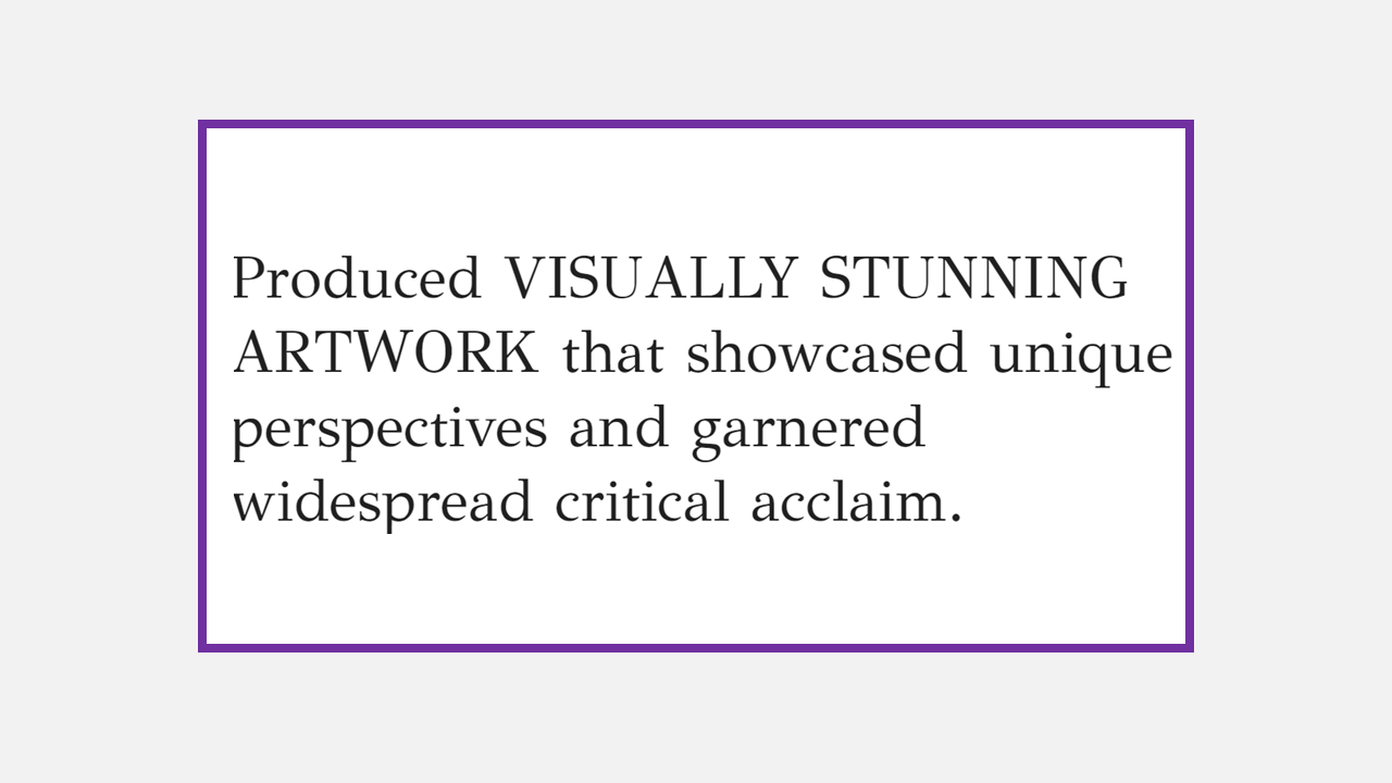
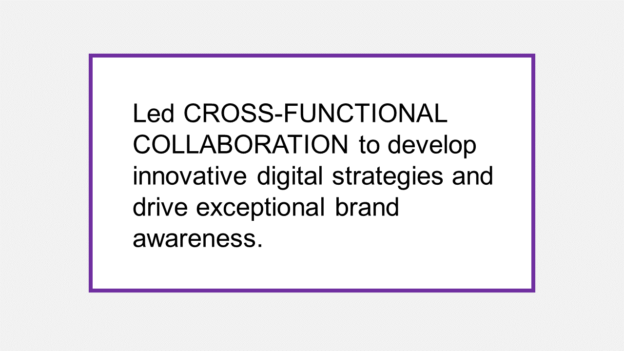
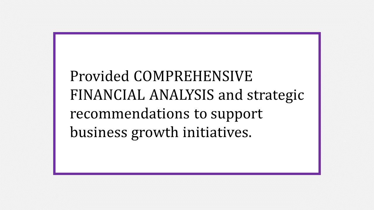
Below you’ll find a list of 10 of the best fonts for resume writing, along with suggestions for which industries they’re best suited to.
You’ll also find an example sentence written in each font to give you a clear picture of look, feel and stylization.
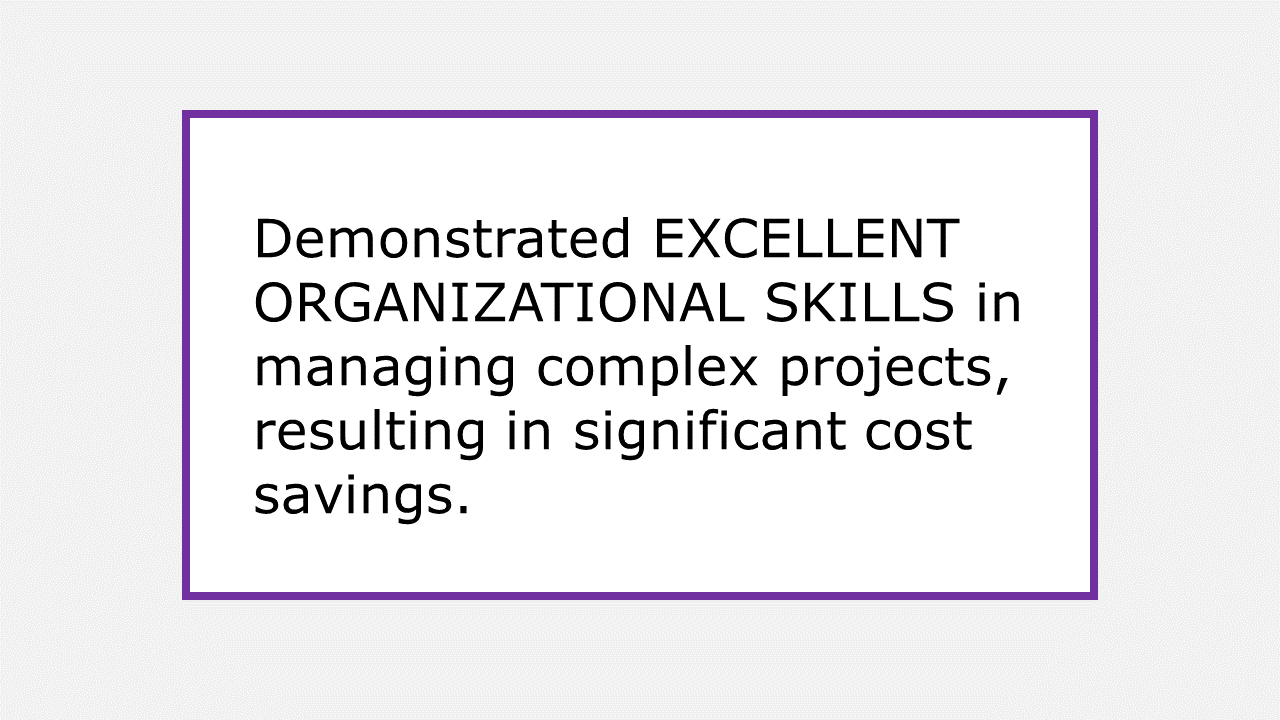
1. Calibri
This clean and modern sans-serif font is an excellent choice for a wide range of industries, particularly in technology, design and marketing. Its sleek and professional appearance adds a contemporary touch to your resume.
Font example:


2. Verdana
With its generous spacing and high legibility, Verdana is widely considered the easiest to read font and is ideal for when you want optimal clarity, such as for healthcare, education and dentistry resumes.
Font example:

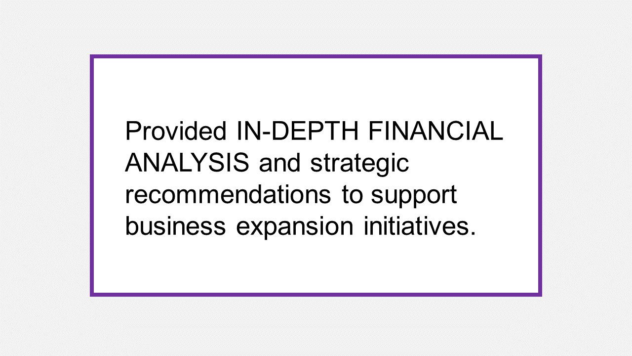
3. Arial
A sans-serif font with a clean and simple design, Arial is suitable for various professional fields, including finance, consulting and legal services.
Font example:

4. Garamond
This elegant serif font conveys sophistication with a hint of decoration, making it an excellent choice for industries such as the arts, fashion and luxury goods.
Font example:

5. Times New Roman
A classic and versatile serif font, Times New Roman is widely used across industries, including finance, legal and academia.
Font example:

6. Trebuchet MS
With its modern and stylish appearance, Trebuchet MS is a great choice for creative industries like advertising, media and graphic design.
Font example:


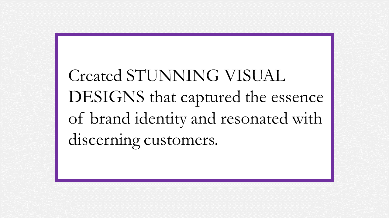
7. Didot
Known for its sophisticated and elegant design, Didot is well-suited for creative fields such as art, photography and publishing.
This font is not readily avaliable on Microsoft Word, however, it is free to download.
Font example:

8. Helvetica
Helvetica's clean and modern aesthetic makes it a versatile choice for industries like technology, advertising and communications.
Font example:

9. Cambria
This elegant and readable serif font is particularly suitable for industries such as finance, consulting and professional services.
It’s a good choice for an investment banking resume.
Font example:

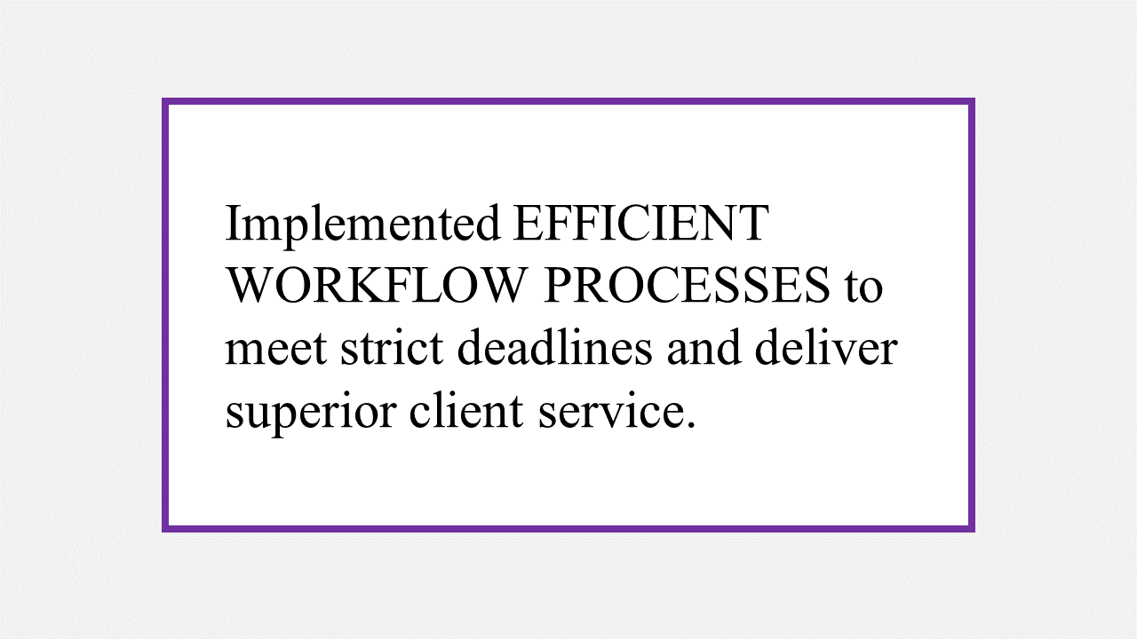
10. Book Antiqua
Combining elegance with readability, Book Antiqua is a great fit for industries that appreciate a traditional and professional aesthetic, such as law, academia and research.
Font example:


What Font for Resume? How to Choose
When choosing what font for resume writing to use, it's important to consider a few key factors to ensure readability and compatibility with the hiring process.
First, keep in mind that hiring managers typically receive resumes in large volumes and have little time to dedicate to screening them. This means yours needs to be clearly legible so the reader can pick out key information at speed.
Second, be aware that recruiters often use Applicant Tracking Systems (ATS) to scan and filter resumes. These systems may struggle to read or parse certain fonts, especially if they’re uncommon or overly stylized.
Always adhere to recommended formatting guidelines and choose fonts that are compatible with ATS requirements to ensure your resume is properly recognized and considered.
You should also follow the tips below to help you pick the best resume font for your next job application.
Consider the Industry
Different industries may have specific preferences or expectations when it comes to good resume fonts.
For example, a more conservative and traditional font like Times New Roman might be suitable for a corporate or formal setting, while a creative or design-oriented field may allow for more flexibility and experimentation with fonts.
Research industry norms and choose a font that aligns with the overall tone and expectations of your target field.
Highlight Key Information
Font styles and sizes can be used strategically to emphasize important sections or information within your resume.
For instance, you can use bold or italic formatting for headings, subheadings or specific achievements to draw attention to them. Be consistent in your use of styles throughout the document to maintain visual coherence.


Seek Feedback
It can be helpful to have someone else review your resume for font readability and overall presentation, preferably someone with experience in hiring or the industry you're targeting.
Different perspectives can offer valuable insights and ensure that your font choice effectively communicates your qualifications.
Don’t Overthink It
While font selection is important, it's crucial to remember that the content and overall presentation of your resume matter more than the specific font choice.
As long as you prioritize clarity, professionalism and readability, you can confidently choose a font that fits your style and the requirements of your industry.
In most cases, using a simple and common font is a safe choice as it won't distract from the content of your resume.
What Size Font for Resume?
Choosing a font size for your resume is all about ensuring effective information presentation, while keeping the document to the recommended two pages.
Here are some general points to consider:
Experiment With Font Size
Different fonts may have varying levels of legibility at different sizes, so it's worth experimenting to find the optimal balance.
Keep in mind that smaller font sizes can be harder to read, while excessively large sizes may look unprofessional or take up too much space.
Use Bold for Emphasis
Instead of relying solely on larger font sizes to draw attention to important information, consider using bold formatting.
By selectively highlighting key headings, subheadings or achievements with bold text, you can guide the reader's attention without altering font size.
Vary Font Sizes Strategically
While it's generally recommended to maintain a consistent font size throughout the main body of your resume, you can use different font sizes for specific sections to improve readability and create visual interest.
Here are some commonly used font sizes for different elements of a resume:
- Heading – Headings like your name, section titles or job titles can be slightly larger to make them stand out. Font sizes between 14 and 16 points are common here.
- Subheadings or section labels – For subheadings or section labels within your resume, font sizes between 11 and 13 points are often used. This helps differentiate them from the main content while maintaining readability.
- Main content – For the main body of your resume, including job descriptions and bullet points, use font sizes ranging from 10 to 12 points. This size strikes a balance between readability and conserving space.
- Consistency is key – While you can play around with font sizes for different sections, it's essential to maintain consistency. Avoid using multiple font sizes within the same subsection, as it can create visual confusion and disrupt the overall flow of your resume.
Frequently Asked Questions
When selecting the best font for resume writing, it’s important to choose one that’s clear, professional and easily readable.
Commonly used easy fonts for resume writing include Calibri, Arial, Verdana, Times New Roman and Helvetica. All of these fonts are widely recognized, legible and compatible with applicant tracking systems (ATS).
Sans-serif fonts like Calibri and Arial offer a modern and clean look, while serif fonts like Times New Roman convey a more traditional and formal feel.
Ultimately, the font choice should align with the nature of the job you’re applying for and ensure that the focus remains on the content rather than the font itself.
There are a number of good fonts for resume writing, each with its own merits, and the choice best suited to your own resume will depend on your objectives.
If you're aiming for a traditional look, consider fonts such as Times New Roman or Garamond. These classic serif fonts exude professionalism and are widely used in formal documents.
If you want your resume to have a more contemporary feel, fonts like Calibri or Helvetica work well. These clean and modern sans-serif fonts provide a fresh and sleek appearance, often preferred in modern resume designs.
There are a few things to consider when deciding what size font for resume writing is ideal. Within the range of 10 to 12 points is generally considered the best size font for a resume, as it ensures readability while conserving space on the page.
You may consider using slightly larger font sizes, around 14 to 16 points, for headings or section titles to make them stand out.
Consistency is crucial here though, so maintain the same font size throughout each section to ensure a cohesive and visually pleasing resume.
The best font for a professional resume is a classic serif or sans-serif font that’s easy to read and scan.
Some of the most popular and recommended fonts for a professional resume include Times New Roman, Arial and Helvetica.
Remember that your resume is just one part of a professional job application, so you should also consider the best font for cover letter writing and the best email font for any follow-up communication.
When it comes to your resume, it’s generally best to avoid using fonts that are overly decorative, humorous or difficult to read.
Some fonts to avoid include Comic Sans, Papyrus, Curlz, Impact and Brush Script as these can look unprofessional, be distracting and diminish the overall impact of your resume.
Additionally, extremely stylized or exotic fonts may not be recognized by Applicant Tracking Systems (ATS), potentially leading to formatting issues or rejection.
Using 10 points is an acceptable font size for a resume, though 11 and 12 points are a better option as font size 10 can strain the reader's eyes, particularly when printed or viewed on smaller screens.
While it may be tempting to reduce the font size to fit more information on a single page, readability is crucial.
If you find your resume is exceeding the desired length, focus on concise and impactful writing, rather than reducing the font size. Remember, a legible and professional presentation is more important than squeezing in additional information.
Lexend is a font designed specifically to improve reading speed and comprehension, particularly for individuals with reading difficulties.
While it may be a good choice for general reading purposes, using Lexend for resumes and cover letters is not widely recommended, as it’s not as commonly recognized or widely used in professional settings.
It's generally safer to stick to more traditional options like Arial, Helvetica or Times New Roman for resume and cover letter fonts, as they convey a sense of professionalism and are familiar to employers and hiring managers.
It’s best to maintain consistency in fonts between your resume and cover letter, as using different fonts can create a visually disjointed and unprofessional impression.
Consistency in font choice on the other hand shows attention to detail and ensures a coherent and polished appearance across your entire application.
The best fonts for cover letter writing are the same as the best fonts for resume writing, so it makes sense to use the same option for both.
Good resume fonts for designers are those that showcase creativity, demonstrate visual skills and align with the design industry's aesthetic.
Designers often prefer sans-serif fonts including Helvetica, Futura, Gotham, Avenir and Proxima Nova.
These choices offer modern and clean aesthetics, allowing designers to present their skills and qualifications in a visually appealing manner.
When choosing the best resume fonts as a designer, consider your personal style and the nature of your work while maintaining readability and a professional appearance.
Franklin Gothic is generally considered as one of the best resume fonts, particularly for individuals in creative or design-related fields. It’s a bold and distinctive sans-serif font that can help your resume stand out.
However, it's important to consider the industry and job you're applying for, as Franklin Gothic may not be as widely recognized in or suitable for non-creative industries.
As an alternative, you might consider Arial, Calibri or Times New Roman, all of which are good fonts for resumes of a more formal nature.
Fonts that are easy on the eye include Arial, Calibri, Helvetica and Times New Roman. These fonts are generally well-liked for their readability and clean design.
However, it's important to note that font preferences can vary among individuals.
When it comes to good fonts for resume writing, the focus should be on clarity and professionalism rather than purely aesthetic appeal.
The goal here is to present your qualifications and work experience in a way that is easily digestible for potential employers.
The best resume font for a Harvard application is one that reflects professionalism and sophistication.
While Harvard does not have specific guidelines, it’s advisable to choose a commonly used font such as Times New Roman, Arial, Calibri or Garamond.
These choices have a traditional and formal appearance, aligning well with the expectations of a prestigious institution like Harvard.
Final Thoughts
The best font for resume writing is largely subjective. Everyone will have their preferred option, and some fonts are better suited to certain industries than others.
When deciding what font for cover letter and resume writing to use, the main thing to remember is that your chosen font should be clean, neat and easy to read. This will help to ensure your resume gets the attention it deserves and makes a good first impression.
Remember too that the font you choose is just one aspect of creating an effective resume. It's equally important to pay attention to the overall layout, content organization and the use of appropriate headings and bullet points.
Ultimately, the goal is to create a resume that’s visually appealing, easy to navigate and that showcases your qualifications and experience in the best possible way.